🏄🏻♂️ Top ML algorithms implemented
Algorithms Covered
- Linear Regression
- Logistic Regression
- Decision Tree
- Random Forest
- SVM
- K-nearest Neighbor
- Naive Bayes
- K-means clustering
- Principle Componenet Analysis (PCA)
- Gradient Boosting
- Multi Layer Perceptron
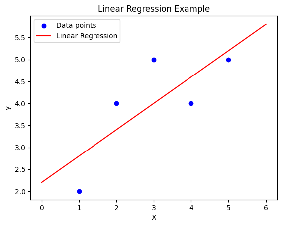
1. Linear Regression
import numpy as np
import matplotlib.pyplot as plt
from sklearn.linear_model import LinearRegression

# Generate sample data
X = np.array([1, 2, 3, 4, 5]).reshape(-1, 1)
y = np.array([2, 4, 5, 4, 5])

# Create and train the model
model = LinearRegression()
model.fit(X, y)

# Make predictions
X_pred = np.linspace(0, 6, 100).reshape(-1, 1)
y_pred = model.predict(X_pred)

# Plot the results
plt.scatter(X, y, color='blue', label='Data points')
plt.plot(X_pred, y_pred, color='red', label='Linear Regression')
plt.xlabel('X')
plt.ylabel('y')
plt.legend()
plt.title('Linear Regression Example')
plt.show()

print(f"Slope: {model.coef_[0]:.2f}")
print(f"Intercept: {model.intercept_:.2f}")
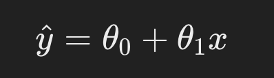
1.1 The Theory Behind Linear Regression
Linear regression is one of the simplest machine learning algorithms. It models the relationship between an independent variable ( X ) (the input) and a dependent variable ( y ) (the output) by fitting a linear equation to the observed data. The model assumes the relationship between the input and output is linear and can be expressed as:
y = wX + b
Where:
- ( X ) is the input feature(s),
- ( y ) is the predicted output,
- ( w ) is the slope (weight),
- ( b ) is the intercept (bias).
The goal is to find the values of ( w ) and ( b ) that minimize the difference between the actual output ( y ) and the predicted output ( y^ ), often measured using the mean squared error (MSE).
Key Concepts in Linear Regression:
- Model Fitting: The process of determining the best values for the parameters ( w ) and ( b ) by minimizing the error between the predicted outputs and the actual outputs.
- Prediction: Once the model is trained (fitted), it can be used to make predictions for new inputs.
1.2 Code Breakdown
Now let’s break down the code step by step:
# Generate sample data
X = np.array([[1], [2], [3], [4], [5]])
y = np.array([2, 4, 5, 4, 5])
- Sample Data:
X: A 2D array of shape(5, 1)representing the input values (independent variable). Each input is a scalar value wrapped in a list (i.e., a column vector).y: A 1D array of shape(5,)representing the corresponding target values (dependent variable). These are the actual outputs we want the model to learn to predict.
In this simplified case, the input values are simple integers (1 to 5), and the output values represent some noisy or imperfectly linear relationship with the input.
# Create and train a linear regression model
model = LinearRegression()
model.fit(X, y)
- Creating the Model:
model = LinearRegression(): We create an instance of theLinearRegressionclass, initializing a linear regression model that will attempt to fit a line to the data points in ( X ) and ( y ).
- Fitting the Model:
model.fit(X, y): Thefitmethod is used to train the linear regression model by finding the best-fitting line that minimizes the prediction error. Internally, the model calculates the weight ( w ) and the bias ( b ) that minimize the mean squared error between the actual values ( y ) and the predicted values ( y^ ).
# Make predictions
new_X = np.array([[6]])
prediction = model.predict(new_X)

print(f"Predicted value for input 6: {prediction[0]:.2f}")
- Making Predictions:
-
new_X = np.array([[6]]): We create a new input,new_X, which contains the value 6. This is the input for which we want the model to predict the output. -
prediction = model.predict(new_X): Thepredictmethod is used to make predictions on new, unseen data. The model uses the learned parameters (weight and bias) to predict the output for the input value 6, using the linear equation:y^=w⋅X+b
The model computes this using the previously learned ( w ) and ( b ) values and returns the predicted output ( y^ ).
-
1.2.1 What’s Happening in the Model Internally?
-
Training: During the training step (
model.fit(X, y)), the model performs linear algebra operations to minimize the error between the predicted values and the true values. Specifically, it uses the ordinary least squares method to find the parameters ( w ) and ( b ). -
Prediction: In the prediction step (
model.predict(new_X)), the learned parameters ( w ) and ( b ) are applied to the new input ( X = 6 ) to calculate the predicted value ( y^ ).
1.2.2 Visualizing the Linear Relationship
We can visualize the learned linear relationship between ( X ) and ( y ) as a straight line that best fits the given data points.
1.3 Gradient descent and loss function
Gradient Descent is a fundamental optimization algorithm used to minimize a function by iteratively moving towards the steepest descent, or the minimum of the function. It is particularly important in machine learning for minimizing the cost function, which measures how well a model fits the data.
Key Concepts in Gradient Descent:
Objective Function (Cost Function): The goal of gradient descent is to minimize the cost function. In linear regression, this is typically the mean squared error between the predicted values and actual values.
-
Gradient: The gradient of the cost function with respect to the model’s parameters tells us the direction of the steepest ascent. Gradient descent updates the parameters by moving in the opposite direction of the gradient (steepest descent).
-
Learning Rate: The learning rate determines the size of the steps we take toward the minimum. A large learning rate can overshoot the minimum, while a small learning rate can make the process slow.
-
Convergence: Gradient descent continues iterating until it converges to a minimum (or stops at a certain number of iterations). This minimum is ideally the global minimum of the cost function, but gradient descent can sometimes get stuck in local minima depending on the problem.
Relevance in Linear Regression:
In linear regression, the objective is to find the best-fit line that minimizes the error between predicted and actual values. The equation of the line is:
Here, 𝜃0 and 𝜃1 are the parameters (intercept and slope), and 𝑥 represents the input data.
The cost function for linear regression is usually the mean squared error:
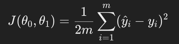
where m is the number of data points, 𝑦𝑖 is the actual value, and 𝑦^𝑖 is the predicted value.
Gradient descent updates the parameters 𝜃0 and 𝜃1 by computing their gradients (derivatives of the cost function) and adjusting the parameters iteratively:
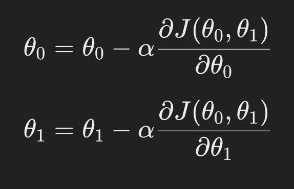
By iteratively updating the parameters in this way, gradient descent reduces the error and finds the optimal parameters for the linear regression model.
1.4 Conclusion
In this simple example, we used Linear Regression to illustrate the concept of machine learning:
- The model learns a linear relationship between input ( X ) and output ( y ) based on training data.
- Once trained, the model can predict outputs for new inputs (such as ( X = 6 )).
- The model works by minimizing the error between predicted and actual values, using ordinary least squares to find the optimal parameters.
2. Logistic regression
import numpy as np
import matplotlib.pyplot as plt
from sklearn.linear_model import LogisticRegression
from sklearn.datasets import make_classification
# Generate sample data
X, y = make_classification(n_samples=100, n_features=2, n_informative=2,
n_redundant=0, n_clusters_per_class=1, random_state=42)
# Create and train the model
model = LogisticRegression()
model.fit(X, y)
# Create a mesh grid for plotting decision boundary
x_min, x_max = X[:, 0].min() - 1, X[:, 0].max() + 1
y_min, y_max = X[:, 1].min() - 1, X[:, 1].max() + 1
xx, yy = np.meshgrid(np.arange(x_min, x_max, 0.1),
np.arange(y_min, y_max, 0.1))
# Make predictions on the mesh grid
Z = model.predict(np.c_[xx.ravel(), yy.ravel()])
Z = Z.reshape(xx.shape)
# Plot the results
plt.contourf(xx, yy, Z, alpha=0.4)
plt.scatter(X[:, 0], X[:, 1], c=y, alpha=0.8)
plt.xlabel('Feature 1')
plt.ylabel('Feature 2')
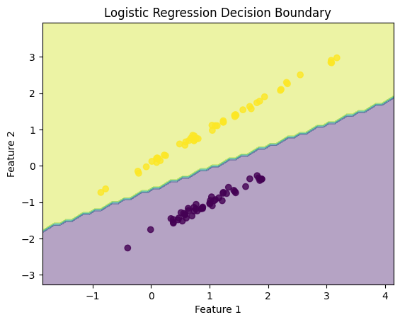
plt.title('Logistic Regression Decision Boundary')
plt.show()
print(f"Model accuracy: {model.score(X, y):.2f}")
This code demonstrates Logistic Regression for a binary classification task, with data visualization showing the decision boundary learned by the model.
2.1 What is Logistic Regression?
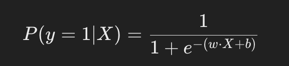
Logistic regression is a supervised learning algorithm used for binary classification. It models the probability that a given input ( X ) belongs to a specific class ( y ), where ( y in {0, 1} ). The model uses a logistic (sigmoid) function to map the output of a linear equation to a probability between 0 and 1:
2.2 Code Breakdown
2.2.1 Data Generation
from sklearn.datasets import make_classification

# Generate sample data
X, y = make_classification(n_samples=100, n_features=2, n_informative=2,
                           n_redundant=0, n_clusters_per_class=1, random_state=42)
make_classificationgenerates a synthetic dataset suitable for classification tasks.n_samples=100: Generates 100 samples.n_features=2: The dataset has 2 features.n_informative=2: Both features are informative (they contribute to determining the class labels).n_redundant=0: No redundant features (features derived from others).random_state=42: Ensures the data is generated consistently for reproducibility.
The generated X is a matrix of shape (100, 2) representing the features, and y is a vector of shape (100,) representing the binary class labels (0 or 1).
2.2.2 Model Training
# Create and train the model
model = LogisticRegression()
model.fit(X, y)
LogisticRegression(): Creates an instance of the logistic regression model fromscikit-learn.model.fit(X, y): Trains the logistic regression model on the input dataXand corresponding labelsy. Internally, the model learns the optimal values for ( w ) and ( b ) (weights and bias) by maximizing the likelihood of correctly classifying the data points.
2.2.3 Creating the Decision Boundary
To visualize the decision boundary, we generate a mesh grid of points that cover the feature space, make predictions for each point on the grid, and then plot the results.
# Create a mesh grid for plotting decision boundary
x_min, x_max = X[:, 0].min() - 1, X[:, 0].max() + 1
y_min, y_max = X[:, 1].min() - 1, X[:, 1].max() + 1
xx, yy = np.meshgrid(np.arange(x_min, x_max, 0.1),
                     np.arange(y_min, y_max, 0.1))
np.meshgrid: This function generates a grid of points covering the feature space. The grid points will be used to compute the decision boundary.xx, yy: Meshgrid arrays that represent the grid points for feature 1 (X-axis) and feature 2 (Y-axis).
What is meshgrid?
- The meshgrid creates a dense grid of points that covers the entire range of your data (and a bit beyond, due to the -1 and +1 in the min/max calculations).
- This dense grid allows for smooth plotting of decision boundaries by evaluating your model at each of these grid points.
- The meshgrid is much denser than your original data, allowing for high-resolution visualization of the decision boundary.
2.2.4 Making Predictions on the Mesh Grid
# Make predictions on the mesh grid
Z = model.predict(np.c_[xx.ravel(), yy.ravel()])
Z = Z.reshape(xx.shape)
np.c_[xx.ravel(), yy.ravel()]: This concatenates the grid points for feature 1 and feature 2 into a single array, which is required for making predictions with the logistic regression model.model.predict: The logistic regression model predicts the class for each grid point.Z = Z.reshape(xx.shape): Reshapes the predictions to match the shape of the grid.
Why do we need to ravel?
- xx and yy are 2D arrays representing a grid of points.
- We need to make predictions for each point in this grid.
- ravel() flattens each 2D array into a 1D array.
- np.c_[…] combines these flattened arrays into a 2D array where each row is a point (x, y) from the grid.
- This 2D array can then be fed into model.predict().
- We reshape the predictions back to the original grid shape for plotting.
- Without raveling, we would need to iterate over each point in the grid, which would be much slower
2.2.5 Plotting the Results
# Plot the results
plt.contourf(xx, yy, Z, alpha=0.4)
plt.scatter(X[:, 0], X[:, 1], c=y, alpha=0.8)
plt.xlabel('Feature 1')
plt.ylabel('Feature 2')
plt.title('Logistic Regression Decision Boundary')
plt.show()
plt.contourf(xx, yy, Z, alpha=0.4): Creates a filled contour plot showing the decision boundary. The boundary separates the two classes (0 and 1) learned by the model.plt.scatter(X[:, 0], X[:, 1], c=y): Plots the original data points, with different colors (c=y) representing the two classes.
This visualization shows how the logistic regression model separates the two classes based on the learned decision boundary.
2.3 Explanation of Logistic Regression Theory
2.3.1 Sigmoid Function and Decision Boundary
In logistic regression, the decision boundary is defined by the equation:
The sigmoid function maps the output of the linear equation ( .X + b ) to a probability between 0 and 1. When plotted, the decision boundary appears as a straight line separating two classes, as logistic regression is a linear classifier.
2.3.2 Model Training Process
-
Learning Weights: The logistic regression model learns the weights ( w ) and bias ( b ) that best separate the two classes by maximizing the likelihood of correctly predicting the labels for the training data.
-
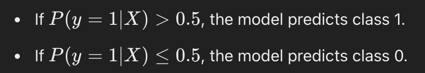
Decision Rule: Once the model is trained, it applies the following decision rule:
2.3.3 When to use Logistic regression?
- When you have a linear relationship between the features and the target variable.
- When interpretability is important. Logistic regression provides clear insights into feature importance (via coefficients).
- When the dataset is small to medium-sized and linearly separable.
- When you need probabilistic outputs (i.e., the probability of class membership).
Not suitable when:
- There is a complex or non-linear relationship between the features and target variable.
- The dataset has too many outliers or irrelevant features, as logistic regression is sensitive to these.
2.4 Conclusion
In this example, we demonstrated how logistic regression works as a binary classifier:
- Training: The logistic regression model was trained using synthetic data generated by
make_classification. - Decision Boundary: The decision boundary was visualized, showing how the model separates the two classes.
- Prediction: The model predicts the class of each point in the feature space based on the learned weights and bias.
3. Decision tree
from sklearn.tree import DecisionTreeClassifier, plot_tree
from sklearn.datasets import load_iris
import matplotlib.pyplot as plt

# Load the Iris dataset
iris = load_iris()
X, y = iris.data, iris.target

# Create and train the model
model = DecisionTreeClassifier(max_depth=3, random_state=42)
model.fit(X, y)

# Plot the decision tree
plt.figure(figsize=(20,10))
plot_tree(model, feature_names=iris.feature_names,
          class_names=iris.target_names, filled=True, rounded=True)
plt.title("Decision Tree for Iris Dataset")
plt.show()

print(f"Model accuracy: {model.score(X, y):.2f}")
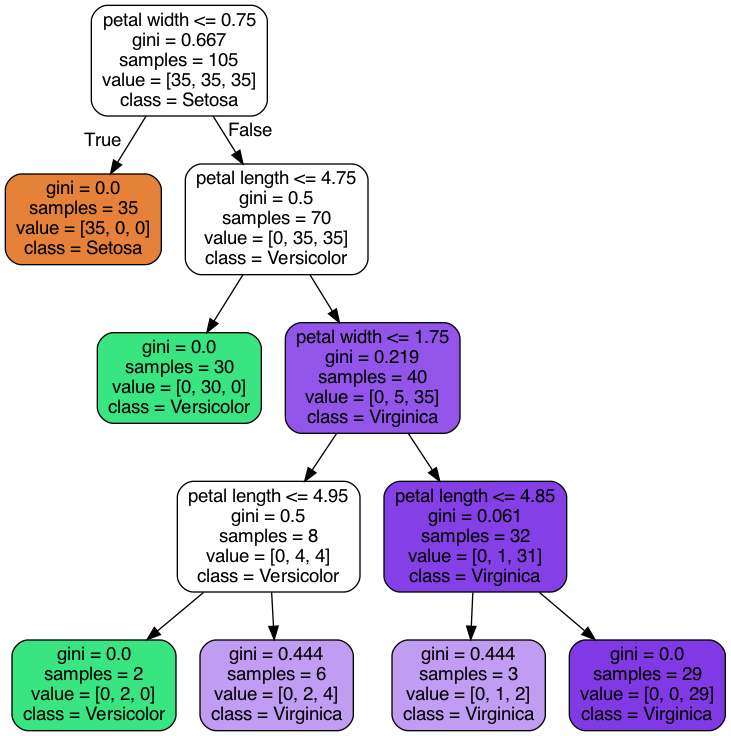
This code demonstrates how to use a Decision Tree Classifier from the scikit-learn library to classify data from the Iris dataset.
3.1 What is a Decision Tree?
A Decision Tree is a machine learning algorithm used for both classification and regression tasks. It splits the data into smaller subsets based on certain conditions, creating a tree-like model where each internal node represents a decision based on a feature, and each leaf node represents a class label (for classification) or a value (for regression).
The decision tree works by:
- Selecting the best feature to split the data based on some criteria (e.g., Gini impurity, information gain).
- Recursively splitting the data until it reaches the stopping criterion (e.g., max depth, all leaf nodes are pure).
- Using the tree structure to classify new data points.
3.2 Code Breakdown
3.2.1 Loading the Iris Dataset
from sklearn.datasets import load_iris

# Load the Iris dataset
iris = load_iris()
X, y = iris.data, iris.target
load_iris(): This function loads the Iris dataset, which contains 150 samples of iris flowers, each belonging to one of three species (Setosa, Versicolor, or Virginica). The dataset includes:- Features:
X, a matrix of shape(150, 4)representing the four attributes of each flower (sepal length, sepal width, petal length, petal width). - Labels:
y, a vector of shape(150,)representing the target species (0 for Setosa, 1 for Versicolor, 2 for Virginica).
- Features:
3.2.2 Creating and Training the Decision Tree Model
from sklearn.tree import DecisionTreeClassifier

# Create and train the model
model = DecisionTreeClassifier(max_depth=3, random_state=42)
model.fit(X, y)
DecisionTreeClassifier(): This initializes the decision tree classifier. The key parameters include:max_depth=3: Limits the depth of the tree to 3, preventing the tree from overfitting by splitting too much.random_state=42: Ensures that the results are reproducible by setting a fixed seed for the random number generator.
model.fit(X, y): This trains the decision tree model by finding the best splits in the data based on the featuresXand the target labelsy.
3.2.3 Visualizing the Decision Tree
from sklearn.tree import plot_tree
import matplotlib.pyplot as plt

# Plot the decision tree
plt.figure(figsize=(20,10))
plot_tree(model, feature_names=iris.feature_names,
          class_names=iris.target_names, filled=True, rounded=True)
plt.title("Decision Tree for Iris Dataset")
plt.show()
plot_tree(): This function visualizes the trained decision tree, showing how the tree splits the data at each node. Key parameters include:feature_names=iris.feature_names: Labels each node with the corresponding feature (e.g., petal length).class_names=iris.target_names: Labels each leaf node with the predicted species (e.g., Setosa, Versicolor, Virginica).filled=True: Colors the nodes based on the predicted class to make the tree easier to interpret.rounded=True: Adds rounded corners to the nodes for better aesthetics.
- Visualization: The
plt.figure(figsize=(20,10))creates a large figure to plot the decision tree clearly, andplt.show()renders the plot.
3.2.4 Evaluating the Model
print(f"Model accuracy: {model.score(X, y):.2f}")
model.score(X, y): This computes the accuracy of the model on the training data. Accuracy is defined as the proportion of correct predictions made by the model. Since we are evaluating on the training data, the model’s performance might be artificially high, especially for a deep tree.
3.3 The Theory Behind Decision Trees
Decision trees work by making a series of binary splits in the data to create a model that predicts the target class. Each split is chosen based on a criterion that maximizes the separation between the classes. Common criteria include:
- Gini Impurity: Measures how “pure” a node is (i.e., how mixed the classes are). A lower Gini impurity means that the node is closer to containing only one class.
- Information Gain: Measures the reduction in entropy (uncertainty) after a split.
3.3.1 How a Decision Tree Splits Data:
- Choosing a Split: At each node, the model selects a feature and a threshold that maximizes class separation (e.g., reduces Gini impurity the most). For example, a split might be “Is petal length < 2.5?”.
- Recursive Splitting: The tree recursively splits the data at each node, creating a tree structure where each internal node represents a decision, and each leaf node represents a class prediction.
- Stopping Criteria: The tree stops growing when one of the stopping criteria is met (e.g., maximum depth, minimum samples per leaf, or pure nodes).
3.3.2 When to use Decision Trees?
- When you need an interpretable model. Decision trees provide an intuitive understanding of the decision-making process.
- When the dataset has non-linear relationships between the features and target variable.
- When you have categorical features. Decision trees handle categorical variables well without needing to encode them.
- When the dataset contains missing values or has both numerical and categorical features, as decision trees can handle these.
Not suitable when:
- The dataset is small and prone to overfitting, as decision trees can easily memorize the data.
- You need high accuracy on larger datasets (in such cases, random forest or gradient boosting may perform better).
3.4 Interpretation of the Plot
- Each node in the tree plot represents a decision point based on a feature and a threshold.
- The leaves represent the final classification outcomes.
- The color of each node indicates the dominant class in that region of the feature space.
- The values in each node represent:
- The number of samples in that node.
- The distribution of samples among the classes (Setosa, Versicolor, Virginica).
- The predicted class.
3.5 Conclusion
- Training: The model learns to split the data into regions based on feature thresholds.
- Visualization: The
plot_treefunction allows for easy visualization and interpretation of the decision-making process. - Accuracy: The model’s accuracy gives a measure of how well it has learned to classify the data, but it’s important to avoid overfitting by controlling the tree’s depth.
4. Random Forest
from sklearn.ensemble import RandomForestClassifier
from sklearn.datasets import make_classification
from sklearn.model_selection import train_test_split
import matplotlib.pyplot as plt
# Generate sample data
X, y = make_classification(n_samples=1000, n_features=20, n_informative=15,
n_redundant=5, random_state=42)
# Split the data into training and testing sets
X_train, X_test, y_train, y_test = train_test_split(X, y, test_size=0.2, random_state=42)
# Create and train the model
model = RandomForestClassifier(n_estimators=100, random_state=42)
model.fit(X_train, y_train)
# Evaluate the model
train_score = model.score(X_train, y_train)
test_score = model.score(X_test, y_test)
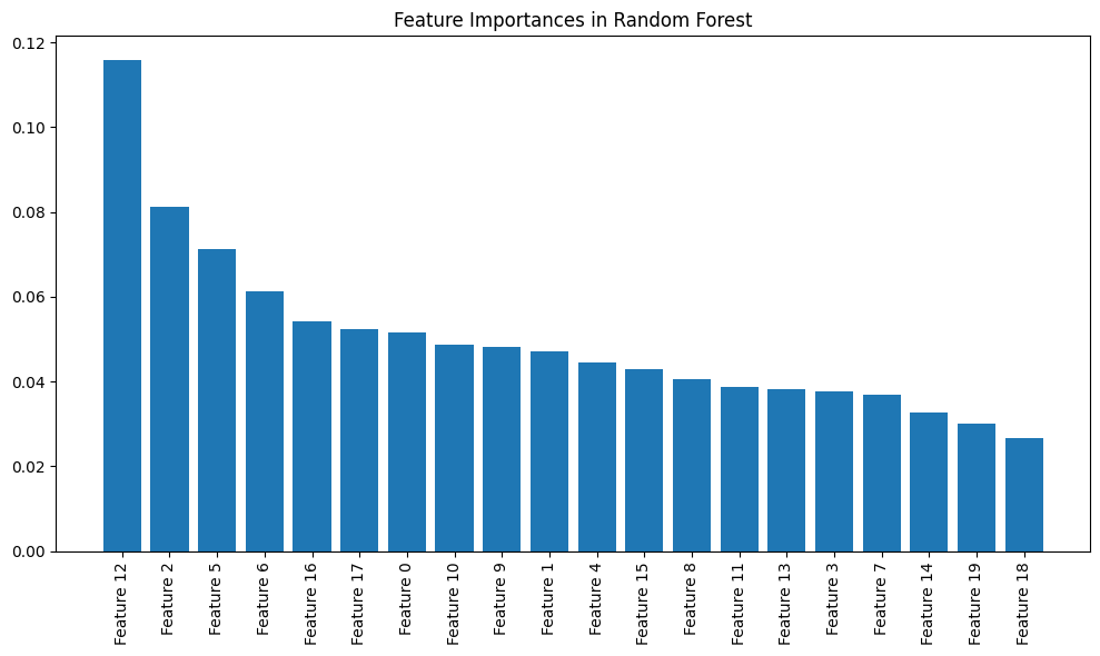
# Plot feature importances
importances = model.feature_importances_
indices = np.argsort(importances)[::-1]
plt.figure(figsize=(10, 6))
plt.title("Feature Importances in Random Forest")
plt.bar(range(20), importances[indices])
plt.xticks(range(20), [f"Feature {i}" for i in indices], rotation=90)
plt.tight_layout()
plt.show()
print(f"Training accuracy: {train_score:.2f}")
print(f"Testing accuracy: {test_score:.2f}")
This code demonstrates how to use a Random Forest Classifier to classify data generated using make_classification. The process involves training the classifier, evaluating it, and visualizing the feature importances.
4.1 What is a Random Forest?
A Random Forest is an ensemble learning algorithm that builds multiple decision trees and combines their results to improve classification accuracy and generalization. It operates by:
- Bagging: Creating multiple training datasets by randomly sampling (with replacement) from the original dataset.
- Feature Randomness: When building each tree, it only considers a random subset of features at each split.
- Combining Results: For classification tasks, it takes the majority vote across all the trees to make a prediction.
Key advantages of Random Forest:
- Reduced overfitting compared to individual decision trees.
- Improved accuracy by aggregating the predictions of multiple trees.
4.2 Code Breakdown
4.2.1 Data Generation
from sklearn.datasets import make_classification
from sklearn.model_selection import train_test_split

# Generate sample data
X, y = make_classification(n_samples=1000, n_features=20, n_informative=15,
                           n_redundant=5, random_state=42)

# Split the data into training and testing sets
X_train, X_test, y_train, y_test = train_test_split(X, y, test_size=0.2, random_state=42)
make_classification:- This function generates a synthetic classification dataset. Key parameters:
n_samples=1000: 1000 data points are generated.n_features=20: Each data point has 20 features.n_informative=15: 15 of the features are informative (they contribute to determining the class label).n_redundant=5: 5 features are redundant (linear combinations of the informative features).random_state=42: Ensures reproducibility of the dataset.
- This function generates a synthetic classification dataset. Key parameters:
train_test_split:- Splits the data into training (80%) and testing (20%) sets. The
random_stateensures that the split is consistent across runs.
- Splits the data into training (80%) and testing (20%) sets. The
4.2.2 Creating and Training the Random Forest Model
from sklearn.ensemble import RandomForestClassifier

# Create and train the model
model = RandomForestClassifier(n_estimators=100, random_state=42)
model.fit(X_train, y_train)
RandomForestClassifier:- Initializes the Random Forest classifier with the following key parameters:
n_estimators=100: The forest will contain 100 decision trees.random_state=42: Ensures that the model generates the same results each time it is run.
- Initializes the Random Forest classifier with the following key parameters:
model.fit(X_train, y_train):- Trains the random forest on the training data (
X_train,y_train). Each tree in the forest is trained on a different subset of the training data (due to bootstrapping) and considers random subsets of the features at each split.
- Trains the random forest on the training data (
4.2.3 Evaluating the Model
# Evaluate the model
train_score = model.score(X_train, y_train)
test_score = model.score(X_test, y_test)
model.score(X_train, y_train):- This evaluates the model on the training data and returns the accuracy (i.e., the proportion of correctly classified samples).
model.score(X_test, y_test):- This evaluates the model on the unseen test data to check its generalization performance.
4.2.4 Plotting Feature Importances
# Plot feature importances
importances = model.feature_importances_
indices = np.argsort(importances)[::-1]

plt.figure(figsize=(10, 6))
plt.title("Feature Importances in Random Forest")
plt.bar(range(20), importances[indices])
plt.xticks(range(20), [f"Feature {i}" for i in indices], rotation=90)
plt.tight_layout()
plt.show()
- Feature Importances:
model.feature_importances_: This attribute contains the importance of each feature, indicating how much each feature contributes to the model’s decision-making process. A higher value indicates a more important feature.np.argsort(importances)[::-1]: This sorts the feature importances in descending order, so the most important features are plotted first.
- Plotting:
plt.bar(): Plots the sorted feature importances using a bar plot. The X-axis represents the feature indices, and the Y-axis shows the importance of each feature.plt.xticks(): Labels the X-axis with the feature indices and rotates them for better readability.
4.2.5 Model Accuracy
print(f"Training accuracy: {train_score:.2f}")
print(f"Testing accuracy: {test_score:.2f}")
Training accuracy: 1.00 Testing accuracy: 0.90
- Training Accuracy: The proportion of correctly classified samples in the training set.
- Testing Accuracy: The proportion of correctly classified samples in the test set, which is a better measure of how well the model generalizes to unseen data.
4.3 Theory Behind Random Forests
4.3.1 Bagging:
Random Forest uses bootstrap aggregation (bagging) to train multiple decision trees on different subsets of the training data. Each tree sees a different view of the data, which helps to reduce overfitting (a common problem in decision trees).
4.3.2 Random Feature Selection:
At each split in a tree, Random Forest randomly selects a subset of features to consider. This increases the diversity among the trees and prevents them from becoming too similar.
4.3.3 Feature Importance:
One of the advantages of Random Forests is that they provide feature importance scores. These scores measure how often a feature is used in the decision splits and how much it improves the classification accuracy.
4.3.4 When to use Random Forest?
- When you have a large dataset with high-dimensional features and need a powerful model that can generalize well.
- When the dataset has a mix of numerical and categorical features.
- When you need a model that can handle non-linear relationships and is more robust to overfitting than decision trees.
- When you need feature importance to understand which features are most important in making predictions.
- When the model needs to handle missing data or noisy data robustly.
Not suitable when:
- Interpretability is crucial. Random forests are more complex and less interpretable compared to decision trees or logistic regression.
- You need real-time predictions or have memory constraints, as random forests can be computationally expensive.
4.4 Conclusion
This example demonstrates how to use Random Forests for classification:
- Training: The model is trained on the generated dataset, learning from random subsets of the features and data points.
- Evaluation: The model’s accuracy is evaluated on both the training and testing sets.
- Feature Importances: The feature importances are plotted, providing insight into which features are most influential in the classification task.
Random Forests are a powerful tool in classification problems, offering robust performance, reducing overfitting, and providing insights into feature importance.
5. SVM
from sklearn.svm import SVC
from sklearn.datasets import make_circles
from sklearn.model_selection import train_test_split
import matplotlib.pyplot as plt
# Generate sample data
X, y = make_circles(n_samples=1000, noise=0.1, factor=0.2, random_state=42)
# Split the data into training and testing sets
X_train, X_test, y_train, y_test = train_test_split(X, y, test_size=0.2, random_state=42)
# Create and train the model
model = SVC(kernel='rbf', C=1.0)
model.fit(X_train, y_train)
# Create a mesh grid for plotting decision boundary
x_min, x_max = X[:, 0].min() - 0.5, X[:, 0].max() + 0.5
y_min, y_max = X[:, 1].min() - 0.5, X[:, 1].max() + 0.5
xx, yy = np.meshgrid(np.arange(x_min, x_max, 0.02),
np.arange(y_min, y_max, 0.02))
# Make predictions on the mesh grid
Z = model.predict(np.c_[xx.ravel(), yy.ravel()])
Z = Z.reshape(xx.shape)
# Plot the results
plt.contourf(xx, yy, Z, alpha=0.8, cmap=plt.cm.RdYlBu)
plt.scatter(X[:, 0], X[:, 1], c=y, cmap=plt.cm.RdYlBu, edgecolor='black')
plt.xlabel('Feature 1')
plt.ylabel('Feature 2')
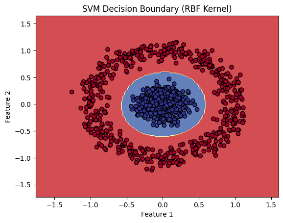
plt.title('SVM Decision Boundary (RBF Kernel)')
plt.show()
print(f"Training accuracy: {model.score(X_train, y_train):.2f}")
print(f"Testing accuracy: {model.score(X_test, y_test):.2f}")
This code demonstrates how to use a Support Vector Machine (SVM) classifier with an RBF (Radial Basis Function) kernel to classify data generated using make_circles.
5.1 What is a Support Vector Machine (SVM)?
A Support Vector Machine (SVM) is a powerful supervised learning algorithm primarily used for classification tasks. The key idea behind SVM is to find the optimal decision boundary (also called a hyperplane) that best separates the data points of different classes. In cases where the data is not linearly separable, kernel methods are used to transform the data into a higher-dimensional space, where a linear separation becomes possible.
Key Concepts:
- Support Vectors: These are the data points that lie closest to the decision boundary. They are critical in defining the position of the hyperplane.
- Margin: The margin is the distance between the decision boundary and the nearest data points from both classes. The goal of SVM is to maximize this margin.
- Kernel Trick: For non-linearly separable data, the kernel trick is used to implicitly project the data into a higher-dimensional space without having to compute the transformation explicitly. The RBF (Radial Basis Function) kernel is commonly used for this purpose.
- C Parameter: The regularization parameter ( C ) controls the trade-off between maximizing the margin and minimizing the classification error.
5.2 Code Breakdown
5.2.1 Data Generation
from sklearn.datasets import make_circles
from sklearn.model_selection import train_test_split

# Generate sample data
X, y = make_circles(n_samples=1000, noise=0.1, factor=0.2, random_state=42)

# Split the data into training and testing sets
X_train, X_test, y_train, y_test = train_test_split(X, y, test_size=0.2, random_state=42)
make_circles:- This function generates a synthetic dataset where data points are arranged in two interleaving circles, which are not linearly separable. This type of dataset is useful for illustrating the power of non-linear kernels like the RBF kernel.
n_samples=1000: Generates 1000 data points.noise=0.1: Adds some Gaussian noise to the data.factor=0.2: Controls the distance between the two circles.random_state=42: Ensures reproducibility.
train_test_split:- Splits the data into training (80%) and testing (20%) sets. The
random_stateensures the same split is produced each time.
- Splits the data into training (80%) and testing (20%) sets. The
5.2.2 Creating and Training the SVM Model
from sklearn.svm import SVC

# Create and train the model
model = SVC(kernel='rbf', C=1.0)
model.fit(X_train, y_train)
SVC(kernel='rbf'):- Initializes the SVM classifier with an RBF kernel. The RBF kernel maps the input data into a higher-dimensional space, allowing the model to find a non-linear decision boundary. Key parameters:
kernel='rbf': Specifies the Radial Basis Function kernel.C=1.0: The regularization parameter. A lower value of ( C ) results in a wider margin but may misclassify some points; a higher value leads to a narrower margin but tries to classify all points correctly.
- Initializes the SVM classifier with an RBF kernel. The RBF kernel maps the input data into a higher-dimensional space, allowing the model to find a non-linear decision boundary. Key parameters:
model.fit(X_train, y_train):- Trains the SVM model using the training data. The model learns the support vectors and the decision boundary that maximizes the margin between the two classes.
5.2.3 Creating the Decision Boundary
# Create a mesh grid for plotting decision boundary
x_min, x_max = X[:, 0].min() - 0.5, X[:, 0].max() + 0.5
y_min, y_max = X[:, 1].min() - 0.5, X[:, 1].max() + 0.5
xx, yy = np.meshgrid(np.arange(x_min, x_max, 0.02),
                     np.arange(y_min, y_max, 0.02))
- Mesh Grid:
- A mesh grid of points is created to cover the entire feature space for feature 1 (X-axis) and feature 2 (Y-axis). This grid will be used to visualize the decision boundary by making predictions on every point in the grid.
np.arange(x_min, x_max, 0.02):- This creates a range of values from
x_mintox_maxwith a step size of 0.02, creating a fine grid for plotting the decision boundary.
- This creates a range of values from
5.2.4 Making Predictions on the Mesh Grid
# Make predictions on the mesh grid
Z = model.predict(np.c_[xx.ravel(), yy.ravel()])
Z = Z.reshape(xx.shape)
model.predict():- The model makes predictions for every point in the mesh grid. This allows us to determine which region of the feature space belongs to class 0 and which belongs to class 1.
np.c_[xx.ravel(), yy.ravel()]:- Concatenates the flattened
xxandyyarrays, preparing the mesh grid points as inputs to the model.
- Concatenates the flattened
Z.reshape(xx.shape):- Reshapes the predicted labels back to the shape of the grid so that they can be used in the contour plot.
5.2.5 Plotting the Decision Boundary
# Plot the results
plt.contourf(xx, yy, Z, alpha=0.8, cmap=plt.cm.RdYlBu)
plt.scatter(X[:, 0], X[:, 1], c=y, cmap=plt.cm.RdYlBu, edgecolor='black')
plt.xlabel('Feature 1')
plt.ylabel('Feature 2')
plt.title('SVM Decision Boundary (RBF Kernel)')
plt.show()
plt.contourf():- Plots the decision boundary by filling the regions of the feature space according to the predicted class labels from the mesh grid. The colors represent different predicted classes.
plt.scatter():- Plots the actual data points, where the color represents the true class labels (0 or 1). The edge color helps differentiate the data points from the background.
5.2.6 Evaluating the Model
print(f"Training accuracy: {model.score(X_train, y_train):.2f}")
print(f"Testing accuracy: {model.score(X_test, y_test):.2f}")
Training accuracy: 1.00
Testing accuracy: 1.00
model.score(X_train, y_train):- Computes the accuracy of the model on the training data. Accuracy is the proportion of correctly classified samples.
model.score(X_test, y_test):- Computes the accuracy of the model on the test data, which is a better measure of how well the model generalizes to unseen data.
5.3 The Theory Behind SVM with RBF Kernel
5.3.1 Linear Separability:
If the data is not linearly separable (as in the case of the make_circles dataset), a linear decision boundary cannot correctly classify the data. This is where kernel functions come into play.
5.3.2 RBF Kernel (Non-linear SVM):
The Radial Basis Function (RBF) kernel is a popular kernel that maps data into a higher-dimensional space, making it easier to find a separating hyperplane. The RBF kernel function is defined as:

Where:
- ( \gamma ) controls the influence of a single training example. A small value of ( \gamma ) implies a Gaussian with a large variance, meaning more training points are considered for each decision boundary.
5.3.3 Hyperparameter ( C ):
The parameter ( C ) controls the trade-off between having a wide margin and allowing some misclassifications. A higher value of ( C ) will try to classify all points correctly (potentially leading to overfitting), while a smaller value will result in a larger margin but may misclassify some points.
5.3.4 When to use SVM?
- When the dataset is high-dimensional and not too large. SVMs work well for problems with many features relative to the number of data points.
- When the classes are separable, either linearly or using a non-linear kernel (e.g., RBF).
- When you need a model that is robust to outliers, especially in a classification setting with clear margins.
- When you need a classifier that can handle both linearly separable and non-linear classification using kernel tricks.
Not suitable when:
- The dataset is very large, as SVM can be slow in both training and prediction for large datasets.
- You need probabilistic predictions; SVMs output hard classification labels unless you use additional techniques.
5.4 Conclusion
This example illustrates how Support Vector Machines (SVM) with the RBF kernel work to classify non-linearly separable data:
- Data: The
make_circlesdataset provides a challenging classification task where data points from two classes are arranged in concentric circles. - SVM with RBF kernel: The SVM uses the RBF kernel to map the data into a higher-dimensional space, where it finds a linear decision boundary that separates the two classes.
- Visualization: The decision boundary is visualized using a contour plot, clearly showing the regions where the model predicts class 0 and class 1.
- Model evaluation: The model’s accuracy on both the training and test sets gives a measure of its performance.
6. K nearest neighbor
from sklearn.neighbors import KNeighborsClassifier
from sklearn.datasets import load_iris
from sklearn.model_selection import train_test_split
import matplotlib.pyplot as plt
# Load the Iris dataset
iris = load_iris()
X, y = iris.data[:, [0, 1]], iris.target # Using only the first two features for visualization
# Split the data into training and testing sets
X_train, X_test, y_train, y_test = train_test_split(X, y, test_size=0.2, random_state=42)
# Create and train the model
model = KNeighborsClassifier(n_neighbors=3)
model.fit(X_train, y_train)
# Create a mesh grid for plotting decision boundary
x_min, x_max = X[:, 0].min() - 0.5, X[:, 0].max() + 0.5
y_min, y_max = X[:, 1].min() - 0.5, X[:, 1].max() + 0.5
xx, yy = np.meshgrid(np.arange(x_min, x_max, 0.02),
np.arange(y_min, y_max, 0.02))
# Make predictions on the mesh grid
Z = model.predict(np.c_[xx.ravel(), yy.ravel()])
Z = Z.reshape(xx.shape)
# Plot the results
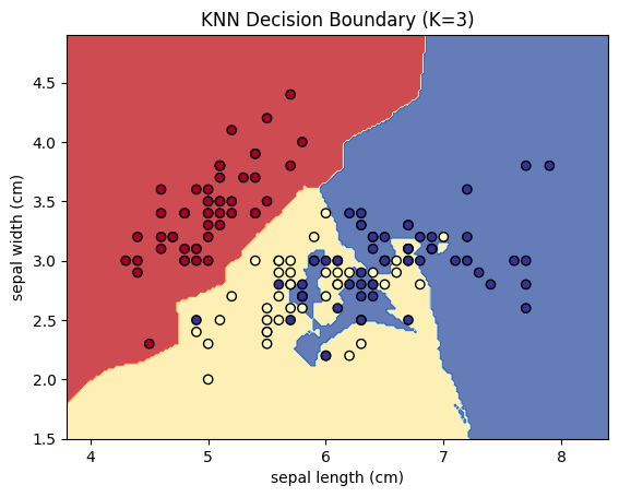
plt.contourf(xx, yy, Z, alpha=0.8, cmap=plt.cm.RdYlBu)
plt.scatter(X[:, 0], X[:, 1], c=y, cmap=plt.cm.RdYlBu, edgecolor='black')
plt.xlabel(iris.feature_names[0])
plt.ylabel(iris.feature_names[1])
plt.title('KNN Decision Boundary (K=3)')
plt.show()
print(f"Training accuracy: {model.score(X_train, y_train):.2f}")
print(f"Testing accuracy: {model.score(X_test, y_test):.2f}")
This code demonstrates how to use the K-Nearest Neighbors (KNN) algorithm to classify data from the Iris dataset using only the first two features for visualization. KNN is a simple yet powerful classification algorithm that works by finding the closest data points to a given input and classifying it based on the majority class of its nearest neighbors.
6.1 What is K-Nearest Neighbors (KNN)?
KNN is a non-parametric and instance-based learning algorithm. It makes predictions by finding the ( k ) nearest data points in the training set for a given input and classifies the input based on the majority label among those neighbors.
Key Concepts:
- Distance Metric: KNN typically uses Euclidean distance to measure the closeness of data points in feature space.
- Number of Neighbors (K): The hyperparameter ( k ) controls how many nearest neighbors to consider for classification. A larger ( k ) smooths the decision boundary, while a smaller ( k ) makes the model more sensitive to noise.
- Lazy Learning: KNN is called a lazy learner because it doesn’t learn a decision function during training. Instead, it memorizes the dataset and performs all computation during prediction.
6.2 Code Breakdown
6.2.1 Loading the Iris Dataset
from sklearn.datasets import load_iris

# Load the Iris dataset
iris = load_iris()
X, y = iris.data[:, [0, 1]], iris.target  # Using only the first two features for visualization
load_iris(): Loads the Iris dataset, which contains 150 samples of iris flowers, with each sample belonging to one of three species (Setosa, Versicolor, Virginica).X = iris.data[:, [0, 1]]: Selects only the first two features (sepal length and sepal width) for easier visualization in 2D.y = iris.target: The target labels for the three species.
6.2.2 Splitting the Data
from sklearn.model_selection import train_test_split

# Split the data into training and testing sets
X_train, X_test, y_train, y_test = train_test_split(X, y, test_size=0.2, random_state=42)
train_test_split:- Splits the data into training (80%) and testing (20%) sets. The
random_stateensures the same split each time the code is run.
- Splits the data into training (80%) and testing (20%) sets. The
6.2.3 Creating and Training the KNN Model
from sklearn.neighbors import KNeighborsClassifier

# Create and train the model
model = KNeighborsClassifier(n_neighbors=3)
model.fit(X_train, y_train)
KNeighborsClassifier(n_neighbors=3):- Initializes the KNN classifier with ( k = 3 ), meaning the algorithm will classify each point based on the majority class of its 3 nearest neighbors.
model.fit(X_train, y_train):- Trains the KNN classifier by simply storing the training data. Since KNN is a lazy learner, it doesn’t build a model in the traditional sense. Instead, it memorizes the training data for future comparisons during prediction.
6.2.4 Creating the Decision Boundary
# Create a mesh grid for plotting decision boundary
x_min, x_max = X[:, 0].min() - 0.5, X[:, 0].max() + 0.5
y_min, y_max = X[:, 1].min() - 0.5, X[:, 1].max() + 0.5
xx, yy = np.meshgrid(np.arange(x_min, x_max, 0.02),
                     np.arange(y_min, y_max, 0.02))
- Mesh Grid:
- A mesh grid of points is created across the feature space, covering the range of values for both features. These grid points will be used to visualize the decision boundary by predicting the class for each point in the grid.
np.arange(x_min, x_max, 0.02):- Creates a range of values from
x_mintox_maxwith a step size of 0.02, creating a fine grid for plotting the decision boundary.
- Creates a range of values from
6.2.5 Making Predictions on the Mesh Grid
# Make predictions on the mesh grid
Z = model.predict(np.c_[xx.ravel(), yy.ravel()])
Z = Z.reshape(xx.shape)
model.predict():- The model makes predictions for every point in the mesh grid to determine which region of the feature space belongs to each class.
np.c_[xx.ravel(), yy.ravel()]:- Concatenates the flattened
xxandyyarrays into a two-column matrix, preparing the grid points as inputs to the model.
- Concatenates the flattened
Z.reshape(xx.shape):- Reshapes the predicted labels to match the shape of the grid so that they can be used in the contour plot.
6.2.6 Plotting the Decision Boundary
# Plot the results
import matplotlib.pyplot as plt

plt.contourf(xx, yy, Z, alpha=0.8, cmap=plt.cm.RdYlBu)
plt.scatter(X[:, 0], X[:, 1], c=y, cmap=plt.cm.RdYlBu, edgecolor='black')
plt.xlabel(iris.feature_names[0])
plt.ylabel(iris.feature_names[1])
plt.title('KNN Decision Boundary (K=3)')
plt.show()
plt.contourf():- Plots the decision boundary by filling the regions of the feature space according to the predicted class labels. Each region is colored according to the class predicted by the KNN model.
plt.scatter():- Plots the actual data points from the Iris dataset, with different colors representing the true class labels (Setosa, Versicolor, Virginica).
6.2.7 Evaluating the Model
print(f"Training accuracy: {model.score(X_train, y_train):.2f}")
print(f"Testing accuracy: {model.score(X_test, y_test):.2f}")
model.score(X_train, y_train):- Computes the accuracy of the model on the training data. Accuracy is the proportion of correctly classified samples.
model.score(X_test, y_test):- Computes the accuracy of the model on the test data, which provides a measure of how well the model generalizes to unseen data.
6.3 The Theory Behind K-Nearest Neighbors
6.3.1 How KNN Works:
- Distance Calculation: For a given test point, KNN computes the distance (typically Euclidean distance) between that point and all points in the training set.
- Selecting Neighbors: The algorithm identifies the ( k ) points in the training set that are closest to the test point.
- Voting: The test point is assigned the class that is most frequent among its ( k ) nearest neighbors.
6.3.2 Choosing ( k ):
- A smaller ( k ) (e.g., ( k=1 )) makes the model sensitive to noise and outliers, leading to a more complex decision boundary.
- A larger ( k ) (e.g., ( k=10 )) smooths the decision boundary, making the model less sensitive to individual data points.
6.3.3 When to use K-Neares Neighbor
- When the dataset is small and you need a simple, easy-to-understand model.
- When the data has a relatively low-dimensional feature space and is not noisy.
- When there is no need for explicit training, as KNN is a lazy learner (it simply memorizes the data).
- When you have local patterns or relationships that can be detected based on proximity to neighbors.
Not suitable when:
- The dataset is large, as KNN can be computationally expensive at prediction time (since it requires calculating distances to all training points).
- The dataset is high-dimensional (the curse of dimensionality can make distance metrics less effective).
- The dataset has many irrelevant features or is noisy, which can mislead the distance-based metric.
6.4 Conclusion
This example demonstrates how K-Nearest Neighbors (KNN) can be applied to classify data and visualize decision boundaries:
- Data: The Iris dataset is a multi-class classification problem, and by using the first two features, we can easily visualize the decision boundary.
- KNN with ( k=3 ): The model classifies each point based on the majority class of its 3 nearest neighbors.
- Decision Boundary: The decision boundary is plotted, showing how the model divides the feature space into regions for each class.
- Evaluation: The accuracy of the model on both the training and test sets gives a measure of how well the model fits the data.
7. Naive Bayes
from sklearn.naive_bayes import GaussianNB
from sklearn.datasets import make_classification
from sklearn.model_selection import train_test_split
import matplotlib.pyplot as plt

# Generate sample data
X, y = make_classification(n_samples=1000, n_features=2, n_informative=2,
                           n_redundant=0, n_clusters_per_class=1, random_state=42)

# Split the data into training and testing sets
X_train, X_test, y_train, y_test = train_test_split(X, y, test_size=0.2, random_state=42)

# Create and train the model
model = GaussianNB()
model.fit(X_train, y_train)

# Create a mesh grid for plotting decision boundary
x_min, x_max = X[:, 0].min() - 1, X[:, 0].max() + 1
y_min, y_max = X[:, 1].min() - 1, X[:, 1].max() + 1
xx, yy = np.meshgrid(np.arange(x_min, x_max, 0.1),
                     np.arange(y_min, y_max, 0.1))

# Make predictions on the mesh grid
Z = model.predict(np.c_[xx.ravel(), yy.ravel()])
Z = Z.reshape(xx.shape)

# Plot the results
plt.contourf(xx, yy, Z, alpha=0.4, cmap=plt.cm.RdYlBu)
plt.scatter(X[:, 0], X[:, 1], c=y, cmap=plt.cm.RdYlBu, edgecolor='black')
plt.xlabel('Feature 1')
plt.ylabel('Feature 2')
plt.title('Naive Bayes Decision Boundary')
plt.show()

print(f"Training accuracy: {model.score(X_train, y_train):.2f}")
print(f"Testing accuracy: {model.score(X_test, y_test):.2f}")
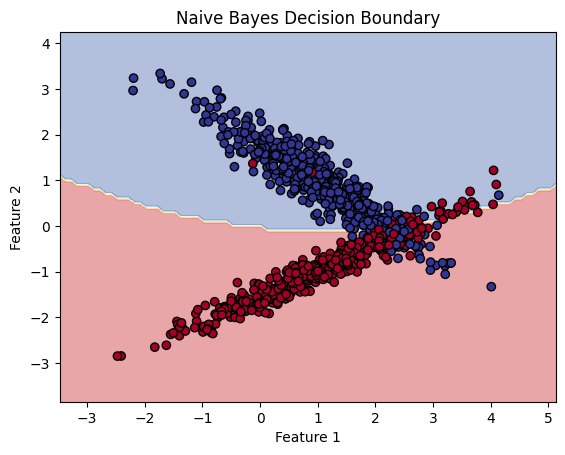
This code demonstrates how to use the Naive Bayes classifier (specifically the Gaussian Naive Bayes) to classify data generated using make_classification. The Gaussian Naive Bayes classifier is a probabilistic model that assumes features are normally distributed and uses Bayes’ theorem for classification.
7.1 What is Naive Bayes?
The Naive Bayes classifier is based on Bayes’ theorem and makes the assumption that the features are conditionally independent given the class label. Despite this “naive” assumption, it performs surprisingly well in many real-world applications, such as text classification, spam filtering, and more.
Bayes’ Theorem:
Bayes’ theorem is given by:
7.2 Code Breakdown
7.2.1 Data Generation
from sklearn.datasets import make_classification
from sklearn.model_selection import train_test_split

# Generate sample data
X, y = make_classification(n_samples=1000, n_features=2, n_informative=2,
                           n_redundant=0, n_clusters_per_class=1, random_state=42)

# Split the data into training and testing sets
X_train, X_test, y_train, y_test = train_test_split(X, y, test_size=0.2, random_state=42)
make_classification:- This function generates a synthetic dataset for classification. Key parameters:
n_samples=1000: 1000 data points are generated.n_features=2: Each data point has 2 features (for easy visualization).n_informative=2: Both features are informative (they contribute to determining the class label).n_redundant=0: No redundant features.random_state=42: Ensures reproducibility.
- This function generates a synthetic dataset for classification. Key parameters:
train_test_split:- Splits the data into training (80%) and testing (20%) sets.
7.2.2 Creating and Training the Naive Bayes Model
from sklearn.naive_bayes import GaussianNB

# Create and train the model
model = GaussianNB()
model.fit(X_train, y_train)
GaussianNB():- Initializes the Gaussian Naive Bayes model. This variant of Naive Bayes assumes that the features follow a Gaussian (normal) distribution.
model.fit(X_train, y_train):-
Trains the Naive Bayes classifier by estimating the parameters of the Gaussian distribution for each feature in each class. The model computes the mean and variance of the features for each class to later calculate the likelihood ( P(X C) ).
-
7.2.3 Creating the Decision Boundary
# Create a mesh grid for plotting decision boundary
x_min, x_max = X[:, 0].min() - 1, X[:, 0].max() + 1
y_min, y_max = X[:, 1].min() - 1, X[:, 1].max() + 1
xx, yy = np.meshgrid(np.arange(x_min, x_max, 0.1),
                     np.arange(y_min, y_max, 0.1))
- Mesh Grid:
- A mesh grid of points is created to cover the entire feature space (feature 1 and feature 2). These grid points will be used to visualize the decision boundary by making predictions on every point in the grid.
7.2.4 Making Predictions on the Mesh Grid
# Make predictions on the mesh grid
Z = model.predict(np.c_[xx.ravel(), yy.ravel()])
Z = Z.reshape(xx.shape)
model.predict():- The model makes predictions for each point in the mesh grid to determine which region of the feature space belongs to each class.
np.c_[xx.ravel(), yy.ravel()]:- Concatenates the flattened
xxandyyarrays into a two-column matrix, preparing the grid points as inputs to the model.
- Concatenates the flattened
Z.reshape(xx.shape):- Reshapes the predicted class labels to match the shape of the grid so that they can be used in the contour plot.
7.2.5 Plotting the Decision Boundary
# Plot the results
import matplotlib.pyplot as plt

plt.contourf(xx, yy, Z, alpha=0.4, cmap=plt.cm.RdYlBu)
plt.scatter(X[:, 0], X[:, 1], c=y, cmap=plt.cm.RdYlBu, edgecolor='black')
plt.xlabel('Feature 1')
plt.ylabel('Feature 2')
plt.title('Naive Bayes Decision Boundary')
plt.show()
plt.contourf():- Plots the decision boundary by filling the regions of the feature space according to the predicted class labels. Each region is colored based on the class predicted by the Naive Bayes model.
plt.scatter():- Plots the actual data points, where the color of each point represents its true class label.
7.2.6 Evaluating the Model
print(f"Training accuracy: {model.score(X_train, y_train):.2f}")
print(f"Testing accuracy: {model.score(X_test, y_test):.2f}")
model.score(X_train, y_train):- Computes the accuracy of the model on the training data. Accuracy is the proportion of correctly classified samples.
model.score(X_test, y_test):- Computes the accuracy of the model on the test data. This evaluates how well the model generalizes to unseen data.
7.3 The Theory Behind Naive Bayes
7.3.1 Assumptions:
-
Conditional Independence: Naive Bayes assumes that the features are conditionally independent given the class label. This means that the value of one feature does not affect the value of another feature, given the class.
-
Gaussian Likelihood: For Gaussian Naive Bayes, we assume that the likelihood P(X_i C) (the probability of feature X_i given class C ) follows a Gaussian (normal) distribution.
7.3.2 Classifying with Naive Bayes:
-
For each class ( C ), Naive Bayes computes the posterior probability ( P(C X) ) using Bayes’ theorem. - The class with the highest posterior probability is chosen as the predicted class for the input ( X ).
7.3.3 When to use Naive Bayes?
- When you have a large dataset and need a model that trains quickly.
- When the features are conditionally independent or approximately independent, which suits the Naive Bayes assumption.
- When you are working with text classification, spam detection, or sentiment analysis (Naive Bayes is often effective in these tasks).
- When you need a probabilistic model that provides the probability of class membership.
Not suitable when:
- The features are highly correlated, as the Naive Bayes assumption of conditional independence would be violated.
- You need a highly accurate model for complex relationships, as Naive Bayes is simple and doesn’t model interaction between features.
7.4 Conclusion
This example demonstrates how Gaussian Naive Bayes can be applied to a classification task:
- Training: The Naive Bayes classifier is trained on a synthetic dataset, assuming that the features follow a Gaussian distribution.
- Decision Boundary: The decision boundary is plotted, showing how the model separates the feature space into regions corresponding to different classes.
- Model Evaluation: The accuracy of the model on both the training and test sets provides insight into how well the model fits the data.
8. K-means clustering
from sklearn.cluster import KMeans
from sklearn.datasets import make_blobs
import matplotlib.pyplot as plt
# Generate sample data
X, _ = make_blobs(n_samples=300, centers=4, cluster_std=0.60, random_state=42)
# Create and fit the model
model = KMeans(n_clusters=4, random_state=42)
model.fit(X)
# Plot the results
plt.scatter(X[:, 0], X[:, 1], c=model.labels_, cmap='viridis')
plt.scatter(model.cluster_centers_[:, 0], model.cluster_centers_[:, 1],
marker='x', s=200, linewidths=3, color='r', label='Centroids')
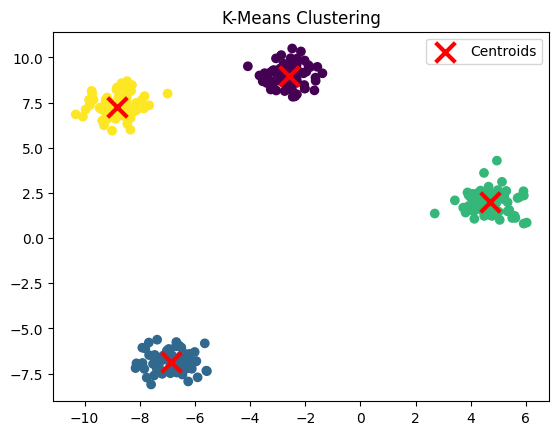
plt.title('K-Means Clustering')
plt.legend()
plt.show()
print(f"Cluster centers:\n{model.cluster_centers_}")
print(f"Inertia: {model.inertia_:.2f}")
This code demonstrates how to perform K-Means clustering using a synthetic dataset generated with make_blobs. It also visualizes the clustering result and provides insight into the clusters’ centers and model performance through inertia.
8.1 What is K-Means Clustering?
K-Means is a popular unsupervised learning algorithm used for clustering. It partitions data points into ( k ) clusters, where each data point belongs to the cluster with the nearest mean (cluster centroid). The algorithm seeks to minimize the inertia, which is the sum of squared distances between data points and their assigned cluster centroids.
Key Concepts:
- Centroid: The center of a cluster. K-Means iteratively updates the centroid position to minimize the distance between points in a cluster and the centroid.
- Inertia: A measure of how well the clusters fit the data. Lower inertia indicates better clustering (tighter clusters).
- Convergence: The algorithm alternates between assigning points to the nearest centroid and updating centroids until the assignments no longer change significantly.
8.2 Code Breakdown
8.2.1 Data Generation
from sklearn.datasets import make_blobs

# Generate sample data
X, _ = make_blobs(n_samples=300, centers=4, cluster_std=0.60, random_state=42)
make_blobs():- Generates a synthetic dataset consisting of clusters of points. Key parameters:
n_samples=300: 300 data points are generated.centers=4: The dataset will have 4 distinct clusters.cluster_std=0.60: The standard deviation of each cluster, controlling how spread out the clusters are.random_state=42: Ensures that the same dataset is generated each time the code is run.
- Generates a synthetic dataset consisting of clusters of points. Key parameters:
8.2.2 Creating and Fitting the K-Means Model
from sklearn.cluster import KMeans

# Create and fit the model
model = KMeans(n_clusters=4, random_state=42)
model.fit(X)
KMeans(n_clusters=4):- Initializes the K-Means model to find 4 clusters (since the dataset was generated with 4 distinct clusters).
model.fit(X):- Trains the K-Means model by iteratively finding the centroids and assigning each data point to the nearest cluster. The algorithm alternates between:
- Step 1 (Assigning Points): Assigning each data point to the nearest centroid.
- Step 2 (Updating Centroids): Recalculating the centroid of each cluster based on the assigned points.
- This process continues until the cluster assignments stop changing or the algorithm reaches the maximum number of iterations.
- Trains the K-Means model by iteratively finding the centroids and assigning each data point to the nearest cluster. The algorithm alternates between:
8.2.3 Plotting the Clustering Results
import matplotlib.pyplot as plt

# Plot the results
plt.scatter(X[:, 0], X[:, 1], c=model.labels_, cmap='viridis')
plt.scatter(model.cluster_centers_[:, 0], model.cluster_centers_[:, 1],
            marker='x', s=200, linewidths=3, color='r', label='Centroids')
plt.title('K-Means Clustering')
plt.legend()
plt.show()
- Plotting the Data Points:
plt.scatter(X[:, 0], X[:, 1], c=model.labels_, cmap='viridis'): This plots the data points, where each point is colored based on the cluster it was assigned to (using themodel.labels_attribute).
- Plotting the Centroids:
plt.scatter(model.cluster_centers_[:, 0], model.cluster_centers_[:, 1], ...): This plots the cluster centroids as red “X” markers. The centroids represent the center of each cluster.
- Legend and Title:
plt.legend(): Adds a legend to label the centroids.plt.title(): Adds a title to the plot, indicating that it is a K-Means clustering visualization.
8.2.4 Cluster Centers and Inertia
print(f"Cluster centers:\n{model.cluster_centers_}")
print(f"Inertia: {model.inertia_:.2f}")
- Cluster Centers:
model.cluster_centers_: Returns the coordinates of the cluster centroids. These centroids are the mean positions of the points in each cluster.
- Inertia:
model.inertia_: Inertia is the sum of squared distances from each data point to its assigned cluster centroid. Lower inertia indicates better clustering (with points closer to their centroids). However, increasing the number of clusters can artificially lower the inertia, so choosing the right ( k ) is important.
Cluster centers: [[-2.60516878 8.99280115] [-6.85126211 -6.85031833] [ 4.68687447 2.01434593] [-8.83456141 7.24430734]] Inertia: 203.89
8.3 The Theory Behind K-Means Clustering
8.3.1 How K-Means Works:
- Initialization: K-Means starts by randomly selecting ( k ) initial centroids or using a heuristic such as k-means++.
- Assigning Points: Each data point is assigned to the nearest centroid based on the Euclidean distance.
- Updating Centroids: The centroids are recalculated as the mean of the points assigned to them.
- Repeating: Steps 2 and 3 are repeated until the centroids stop moving significantly (convergence) or the maximum number of iterations is reached.
8.3.2 Choosing the Number of Clusters:
- The Elbow Method is often used to determine the optimal number of clusters ( k ). It involves plotting the inertia against different values of ( k ) and looking for a point where the inertia decreases sharply (the “elbow”).
8.3.3 When to choose K-Means Clustering?
- When you need to find clusters in an unlabeled dataset (i.e., unsupervised learning).
- When the data naturally clusters into distinct groups, and you need to group similar data points.
- When you have spherical clusters (K-Means works best when clusters are round and evenly sized).
- When you need a quick clustering algorithm that is easy to implement and scale.
Not suitable when:
- The dataset has overlapping or non-spherical clusters (K-Means assumes that clusters a are spherical).
- The number of clusters 𝑘
- k is not known in advance (although you can use methods like the Elbow Method to estimate the best k).
- The dataset contains categorical features, as K-Means operates on numerical data and uses distance metrics like Euclidean distance.
8.4 Conclusion
This example demonstrates how K-Means clustering works:
- Data: A synthetic dataset with 4 distinct clusters is generated.
- K-Means Clustering: The model is trained to find 4 clusters, and the results are visualized with the centroids marked.
- Inertia: The inertia is a measure of how well the clusters fit the data, with lower inertia indicating tighter clusters.

9. PCA
from sklearn.decomposition import PCA
from sklearn.datasets import load_iris
import matplotlib.pyplot as plt

# Load the Iris dataset
iris = load_iris()
X, y = iris.data, iris.target

# Create and fit the PCA model
pca = PCA(n_components=2)
X_pca = pca.fit_transform(X)

# Plot the results
plt.figure(figsize=(10, 8))
scatter = plt.scatter(X_pca[:, 0], X_pca[:, 1], c=y, cmap='viridis')
plt.xlabel('First Principal Component')
plt.ylabel('Second Principal Component')
plt.title('PCA of Iris Dataset')
plt.colorbar(scatter)
plt.show()

print(f"Explained variance ratio: {pca.explained_variance_ratio_}")
print(f"Total explained variance: {sum(pca.explained_variance_ratio_):.2f}")
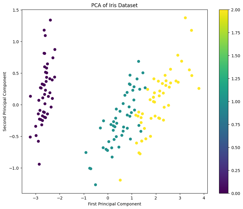
Explained variance ratio: [0.92461872 0.05306648]
Total explained variance: 0.98
This code demonstrates how to apply Principal Component Analysis (PCA) to the Iris dataset, reduce the dimensionality of the data from four features to two, and visualize the result. PCA is a powerful unsupervised technique for reducing the dimensionality of data while preserving as much of the variance (information) as possible.
9.1 What is Principal Component Analysis (PCA)?
PCA is a dimensionality reduction technique that transforms high-dimensional data into a lower-dimensional space. The goal is to reduce the number of features while retaining as much of the variance (information) in the data as possible. PCA achieves this by finding new axes, called principal components, that are linear combinations of the original features.
Key Concepts:
- Principal Components: These are the new axes along which the variance in the data is maximized. The first principal component explains the largest amount of variance, the second explains the next largest, and so on.
- Explained Variance: The amount of variance captured by each principal component. Higher explained variance indicates that the principal component captures more information from the original data.
- Dimensionality Reduction: PCA reduces the dimensionality of data by selecting a subset of the principal components, typically the ones that explain the most variance.
9.2 Code Breakdown
9.2.1 Loading the Iris Dataset
from sklearn.datasets import load_iris

# Load the Iris dataset
iris = load_iris()
X, y = iris.data, iris.target
load_iris(): Loads the Iris dataset, which contains 150 samples of iris flowers. Each sample has four features (sepal length, sepal width, petal length, petal width) and a target label (0, 1, 2) corresponding to three different species.X: The feature matrix, which has 150 samples and 4 features.y: The target labels (species) for each sample.
9.2.2 Applying PCA
from sklearn.decomposition import PCA

# Create and fit the PCA model
pca = PCA(n_components=2)
X_pca = pca.fit_transform(X)
PCA(n_components=2):- Initializes the PCA model to reduce the data to 2 principal components. This is a common approach when visualizing high-dimensional data in 2D space.
pca.fit_transform(X):- Fits the PCA model to the data and transforms the original 4-dimensional data into a 2-dimensional space. The resulting
X_pcamatrix has shape(150, 2), representing the projections of the original data points onto the first two principal components.
- Fits the PCA model to the data and transforms the original 4-dimensional data into a 2-dimensional space. The resulting
9.2.3 Visualizing the PCA Results
import matplotlib.pyplot as plt

# Plot the results
plt.figure(figsize=(10, 8))
scatter = plt.scatter(X_pca[:, 0], X_pca[:, 1], c=y, cmap='viridis')
plt.xlabel('First Principal Component')
plt.ylabel('Second Principal Component')
plt.title('PCA of Iris Dataset')
plt.colorbar(scatter)
plt.show()
plt.scatter():- Plots the first principal component (on the X-axis) against the second principal component (on the Y-axis). Each point represents a flower, and the color (
c=y) corresponds to the species (target label).
- Plots the first principal component (on the X-axis) against the second principal component (on the Y-axis). Each point represents a flower, and the color (
plt.colorbar():- Adds a color bar to the plot, helping to map the colors to the species.
- Axes Labels and Title:
- The X-axis is labeled as “First Principal Component,” and the Y-axis is labeled as “Second Principal Component” to indicate the new axes. The plot is titled “PCA of Iris Dataset.”
9.2.4 Explained Variance
print(f"Explained variance ratio: {pca.explained_variance_ratio_}")
print(f"Total explained variance: {sum(pca.explained_variance_ratio_):.2f}")
pca.explained_variance_ratio_:- This attribute provides the amount of variance explained by each principal component. For example, the first element in this array tells you how much of the total variance is explained by the first principal component, and the second element tells you the same for the second principal component.
- Total Explained Variance:
- The sum of the explained variance ratios gives the total amount of variance explained by the selected principal components (in this case, the first two components). A higher total explained variance indicates that these components capture most of the information in the original data.
9.3 The Theory Behind PCA
9.3.1 How PCA Works:
- Standardization: PCA typically starts by standardizing the data to have a mean of 0 and a variance of 1, ensuring that all features contribute equally.
- Covariance Matrix: PCA computes the covariance matrix of the data, which measures how different features vary together.
- Eigenvectors and Eigenvalues: PCA finds the eigenvectors and eigenvalues of the covariance matrix. The eigenvectors define the directions of the principal components, and the eigenvalues define the amount of variance along these directions.
- Transforming the Data: The original data is projected onto the principal components, resulting in a transformed dataset with reduced dimensionality.
9.3.2 Explained Variance:
The amount of variance explained by each principal component tells us how much of the original data’s variability is captured by the component. For example, if the first principal component explains 70% of the variance, it means that projecting the data onto this component retains 70% of the information.
9.3.3 When to use PCA?
- Before classification to reduce the dimensionality of the dataset, especially when there are many features that are highly correlated.
- When you need to reduce overfitting by selecting fewer, more informative components.
- When you want to visualize high-dimensional data in a lower-dimensional space (2D or 3D).
- When you want to speed up the training of other classifiers by reducing the number of features.
Not suitable when:
- The data is inherently non-linear; PCA is a linear method and might not capture non-linear relationships.
- The interpretability of features is important, as PCA creates new composite features that are linear combinations of the original features.
Common Use Case:
- PCA is often used as a preprocessing step before applying other classification algorithms like SVM, logistic regression, or random forest to reduce dimensionality and improve model performance.
9.4 Conclusion
This example demonstrates how Principal Component Analysis (PCA) can be applied to a multi-dimensional dataset:
- Dimensionality Reduction: PCA reduces the Iris dataset from 4 dimensions to 2 dimensions while preserving the maximum variance.
- Visualization: The transformed data is plotted, showing how the different species of iris flowers are separated in the new 2D space.
- Explained Variance: The explained variance ratio provides insight into how much information (variance) is retained by the selected principal components.
10. Gradient boosting
from sklearn.ensemble import GradientBoostingClassifier
from sklearn.datasets import make_classification
from sklearn.model_selection import train_test_split
import matplotlib.pyplot as plt

# Generate sample data
X, y = make_classification(n_samples=1000, n_features=20, n_informative=15, random_state=42)

# Split the data
X_train, X_test, y_train, y_test = train_test_split(X, y, test_size=0.2, random_state=42)

# Create and train the model
model = GradientBoostingClassifier(n_estimators=100, learning_rate=0.1, random_state=42)
model.fit(X_train, y_train)

# Evaluate the model
train_score = model.score(X_train, y_train)
test_score = model.score(X_test, y_test)

# Plot feature importances
importances = model.feature_importances_
indices = np.argsort(importances)[::-1]

plt.figure(figsize=(10, 6))
plt.title("Feature Importances in Gradient Boosting")
plt.bar(range(20), importances[indices])
plt.xticks(range(20), [f"F{i}" for i in indices], rotation=90)
plt.tight_layout()
plt.show()

print(f"Training accuracy: {train_score:.2f}")
print(f"Testing accuracy: {test_score:.2f}")
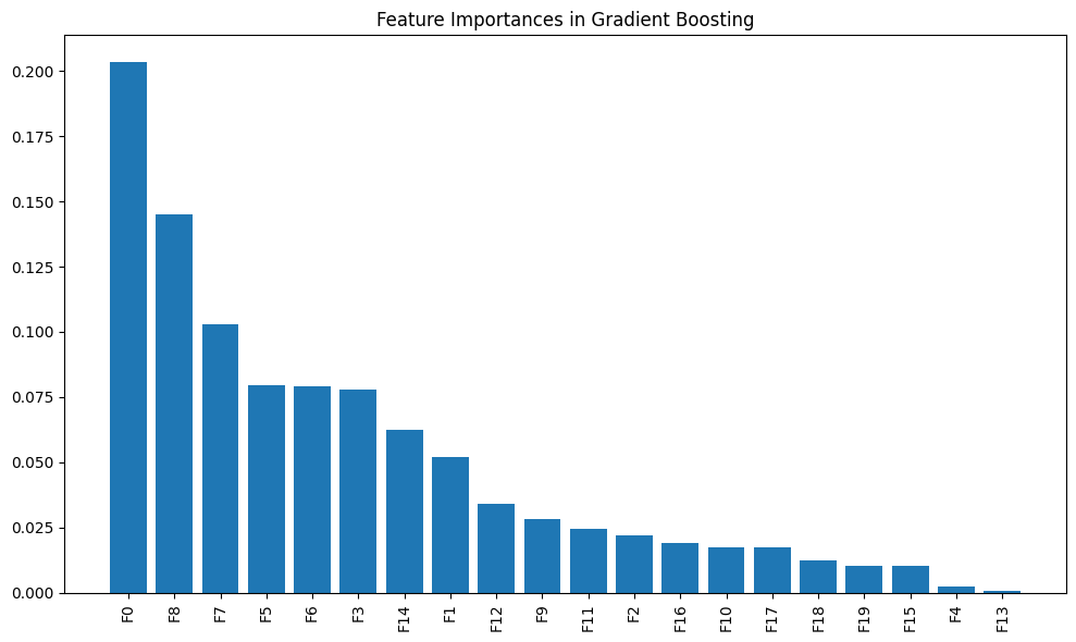 Training accuracy: 1.00
Testing accuracy: 0.89
Training accuracy: 1.00
Testing accuracy: 0.89
This code demonstrates how to use a Gradient Boosting Classifier to perform classification on a synthetic dataset generated with make_classification. Gradient Boosting is a powerful ensemble learning method that builds an additive model in a stage-wise manner, optimizing for accuracy at each stage.
10.1 What is Gradient Boosting?
Gradient Boosting is a machine learning technique for building an ensemble of decision trees. It combines the predictions of many weak learners (typically decision trees) into a stronger learner in an iterative fashion. Gradient Boosting focuses on minimizing the prediction errors by correcting the mistakes made by the previous trees, iteratively improving the model.
Key Concepts:
- Weak Learner: A decision tree is typically used as the weak learner. In Gradient Boosting, these trees are shallow and have few splits (usually referred to as “stumps”).
- Additive Model: Gradient Boosting builds the final model in an additive manner, meaning it sequentially adds new trees to improve performance by reducing the residual errors.
- Learning Rate: The learning rate controls how much each tree contributes to the final model. A smaller learning rate slows down the learning process and often requires more trees.
10.2 Code Breakdown
10.2.1 Generating the Data
from sklearn.datasets import make_classification
from sklearn.model_selection import train_test_split

# Generate sample data
X, y = make_classification(n_samples=1000, n_features=20, n_informative=15, random_state=42)

# Split the data
X_train, X_test, y_train, y_test = train_test_split(X, y, test_size=0.2, random_state=42)
make_classification():- Generates a synthetic dataset suitable for classification tasks. Key parameters:
n_samples=1000: 1000 data points are generated.n_features=20: Each data point has 20 features.n_informative=15: 15 features are informative, meaning they contribute to determining the class label.random_state=42: Ensures reproducibility.
- Generates a synthetic dataset suitable for classification tasks. Key parameters:
train_test_split():- Splits the data into training (80%) and testing (20%) sets. The
random_stateensures consistent splits across different runs.
- Splits the data into training (80%) and testing (20%) sets. The
10.2.2 Creating and Training the Gradient Boosting Classifier
from sklearn.ensemble import GradientBoostingClassifier

# Create and train the model
model = GradientBoostingClassifier(n_estimators=100, learning_rate=0.1, random_state=42)
model.fit(X_train, y_train)
GradientBoostingClassifier():- Initializes the Gradient Boosting classifier. Key parameters:
n_estimators=100: Specifies the number of boosting stages (or trees). More trees generally improve performance but increase computational cost.learning_rate=0.1: Controls how much each tree contributes to the overall model. Lower values require more trees but can improve generalization.random_state=42: Ensures that the model behaves consistently between runs by setting a random seed.
- Initializes the Gradient Boosting classifier. Key parameters:
model.fit(X_train, y_train):- Trains the Gradient Boosting model by sequentially adding decision trees that correct the errors of the previous trees. The model uses gradient descent to minimize the prediction error at each stage.
10.2.3 Evaluating the Model
# Evaluate the model
train_score = model.score(X_train, y_train)
test_score = model.score(X_test, y_test)
model.score(X_train, y_train):- Computes the accuracy of the model on the training data. Accuracy is the proportion of correctly classified samples.
model.score(X_test, y_test):- Computes the accuracy of the model on the test data, providing insight into how well the model generalizes to unseen data.
10.2.4 Plotting Feature Importances
# Plot feature importances
importances = model.feature_importances_
indices = np.argsort(importances)[::-1]

plt.figure(figsize=(10, 6))
plt.title("Feature Importances in Gradient Boosting")
plt.bar(range(20), importances[indices])
plt.xticks(range(20), [f"F{i}" for i in indices], rotation=90)
plt.tight_layout()
plt.show()
- Feature Importances:
model.feature_importances_: Returns the importance of each feature in the model. The importance of a feature is measured by how much it contributes to reducing the error across the boosting iterations.np.argsort(importances)[::-1]: Sorts the feature importances in descending order.
- Plotting:
plt.bar(): Creates a bar plot showing the feature importances. The X-axis represents the feature indices (labeledF0,F1, etc.), and the Y-axis represents the importance score for each feature.
10.3 The Theory Behind Gradient Boosting
10.3.1 How Gradient Boosting Works:
- Initialization: The model starts by fitting a simple model (usually a decision tree) to the data.
- Residuals: At each stage, the model calculates the residual errors (the difference between the predicted values and the actual values).
- New Tree: A new decision tree is trained to predict the residual errors. This tree corrects the mistakes made by the previous tree.
- Updating the Model: The predictions of the new tree are combined with the previous trees to update the model.
- Learning Rate: The learning rate controls the contribution of each tree to the overall model. A smaller learning rate results in smaller updates and typically requires more trees.
10.3.2 Advantages of Gradient Boosting:
- Highly Accurate: Gradient Boosting often outperforms other models, especially when the hyperparameters are well-tuned.
- Feature Importance: It provides insights into which features are most important in making predictions.
- Customizability: It allows for control over the number of trees, learning rate, and other parameters, making it flexible for various problems.
10.3.3 Challenges:
- Training Time: Gradient Boosting can be slow to train because it builds trees sequentially.
- Overfitting: Without careful tuning (especially of the number of trees and learning rate), Gradient Boosting models can overfit the training data.
10.3.4 When to use Gradient boosting?
- When you need a highly accurate model, especially for tabular data or structured datasets.
- When the dataset contains complex, non-linear relationships that simpler models can’t capture.
- When you want a robust model that can handle outliers, noisy data, and missing data.
- When you need feature importance to understand the impact of different features.
Not suitable when:
- Training time is a concern, as Gradient Boosting can be slow, especially with a large number of trees.
- You need an interpretable model, as Gradient Boosting is more complex than simpler models like decision trees or logistic regression.
10.4 Conclusion
This example demonstrates how Gradient Boosting can be applied to a classification task:
- Training: The model is trained to sequentially add decision trees that minimize the classification error.
- Evaluation: The accuracy of the model is evaluated on both the training and testing sets to assess performance.
- Feature Importances: The feature importances are plotted to show which features contribute the most to the model’s predictions.
Multi Layer Perceptron
import numpy as np
import matplotlib.pyplot as plt
from sklearn.neural_network import MLPClassifier
from sklearn.datasets import make_moons
from sklearn.model_selection import train_test_split

# Generate sample data
X, y = make_moons(n_samples=1000, noise=0.1, random_state=42)

# Split the data
X_train, X_test, y_train, y_test = train_test_split(X, y, test_size=0.2, random_state=42)

# Create and train the model
model = MLPClassifier(hidden_layer_sizes=(10, 5), max_iter=1000, random_state=42)
model.fit(X_train, y_train)

# Create a mesh grid for plotting decision boundary
x_min, x_max = X[:, 0].min() - 0.5, X[:, 0].max() + 0.5
y_min, y_max = X[:, 1].min() - 0.5, X[:, 1].max() + 0.5
xx, yy = np.meshgrid(np.arange(x_min, x_max, 0.02),
                     np.arange(y_min, y_max, 0.02))

# Make predictions on the mesh grid
Z = model.predict(np.c_[xx.ravel(), yy.ravel()])
Z = Z.reshape(xx.shape)

# Plot the results
plt.contourf(xx, yy, Z, alpha=0.8, cmap=plt.cm.RdYlBu)
plt.scatter(X[:, 0], X[:, 1], c=y, cmap=plt.cm.RdYlBu, edgecolor='black')
plt.xlabel('Feature 1')
plt.ylabel('Feature 2')
plt.title('Neural Network Decision Boundary')
plt.show()

print(f"Training accuracy: {model.score(X_train, y_train):.2f}")
print(f"Testing accuracy: {model.score(X_test, y_test):.2f}")
This code demonstrates how to use a Multi-Layer Perceptron (MLP), which is a type of neural network, to classify data generated using make_moons. It also visualizes the decision boundary and evaluates the accuracy of the model on both training and test sets.
11.1 What is a Multi-Layer Perceptron (MLP)?
An MLP is a class of feedforward artificial neural network that consists of at least three layers:
- Input layer: The features from the dataset are fed into the model.
- Hidden layers: These layers process the input using weights and activation functions. They help the model learn complex patterns in the data.
- Output layer: This layer generates the final output (class labels in classification tasks).
In an MLP, every neuron in a layer is connected to every neuron in the next layer. This is a fully connected neural network.
Key Concepts:
- Activation Functions: Activation functions such as the ReLU or sigmoid function introduce non-linearity into the network, enabling the model to learn complex relationships.
- Backpropagation: The model is trained using backpropagation, where errors are propagated backward through the network, and the weights are updated using gradient descent to minimize the error.
11.2 Code Breakdown
11.2.1 Generating the Data
from sklearn.datasets import make_moons
from sklearn.model_selection import train_test_split

# Generate sample data
X, y = make_moons(n_samples=1000, noise=0.1, random_state=42)

# Split the data
X_train, X_test, y_train, y_test = train_test_split(X, y, test_size=0.2, random_state=42)
make_moons():- Generates a dataset with two interleaving moon-shaped clusters. It’s commonly used for demonstrating non-linear classification problems.
n_samples=1000: Generates 1000 data points.noise=0.1: Adds some noise to the data to make it more challenging for the model to learn.
train_test_split():- Splits the data into training (80%) and testing (20%) sets to evaluate the model’s performance on unseen data.
11.2.2 Creating and Training the MLPClassifier
from sklearn.neural_network import MLPClassifier

# Create and train the model
model = MLPClassifier(hidden_layer_sizes=(10, 5), max_iter=1000, random_state=42)
model.fit(X_train, y_train)
MLPClassifier():- Initializes the Multi-Layer Perceptron classifier. Key parameters:
hidden_layer_sizes=(10, 5): Specifies two hidden layers, the first with 10 neurons and the second with 5 neurons. These hidden layers allow the model to learn non-linear relationships in the data.max_iter=1000: Limits the number of iterations (or training epochs) to 1000 to ensure the model has enough time to converge.random_state=42: Ensures that the model produces consistent results across runs by setting the seed for the random number generator.
- Initializes the Multi-Layer Perceptron classifier. Key parameters:
model.fit(X_train, y_train):- Trains the neural network using backpropagation. The model adjusts the weights of the neurons iteratively to minimize the error between the predicted and actual class labels.
11.2.3 Creating the Decision Boundary
# Create a mesh grid for plotting decision boundary
x_min, x_max = X[:, 0].min() - 0.5, X[:, 0].max() + 0.5
y_min, y_max = X[:, 1].min() - 0.5, X[:, 1].max() + 0.5
xx, yy = np.meshgrid(np.arange(x_min, x_max, 0.02),
                     np.arange(y_min, y_max, 0.02))
- Mesh Grid:
- A mesh grid is created to cover the entire feature space (the area spanned by feature 1 and feature 2). The grid points will be used to visualize the decision boundary by predicting the class for each point in the grid.
11.2.4 Making Predictions on the Mesh Grid
# Make predictions on the mesh grid
Z = model.predict(np.c_[xx.ravel(), yy.ravel()])
Z = Z.reshape(xx.shape)
model.predict():- The model predicts the class labels for each point in the mesh grid. This allows us to plot the decision boundary of the neural network.
np.c_[xx.ravel(), yy.ravel()]:- This concatenates the flattened mesh grid arrays into a 2D array where each row represents a point in the feature space.
Z.reshape(xx.shape):- Reshapes the predicted class labels to match the shape of the mesh grid for plotting.
11.2.5 Plotting the Decision Boundary
import matplotlib.pyplot as plt

# Plot the results
plt.contourf(xx, yy, Z, alpha=0.8, cmap=plt.cm.RdYlBu)
plt.scatter(X[:, 0], X[:, 1], c=y, cmap=plt.cm.RdYlBu, edgecolor='black')
plt.xlabel('Feature 1')
plt.ylabel('Feature 2')
plt.title('Neural Network Decision Boundary')
plt.show()
plt.contourf():- Plots the decision boundary by filling the regions in the feature space according to the predicted class labels. Different regions are colored based on the class predicted by the MLP model.
plt.scatter():- Plots the actual data points, with different colors representing the true class labels (0 or 1). The edge color is used to distinguish the points from the decision boundary.
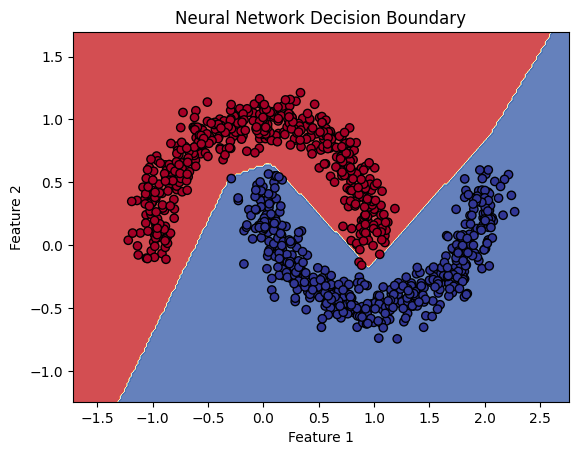
11.2.6 Evaluating the Model
print(f"Training accuracy: {model.score(X_train, y_train):.2f}")
print(f"Testing accuracy: {model.score(X_test, y_test):.2f}")
model.score():- This function returns the accuracy of the model, which is the proportion of correctly classified samples. The accuracy is printed for both the training and test sets, allowing us to assess how well the model has generalized to unseen data.
11.3 The Theory Behind Neural Networks and MLP
11.3.1 How Neural Networks Work:
- Feedforward Network: In an MLP, information flows from the input layer through the hidden layers to the output layer. Each layer performs a weighted sum of its inputs followed by an activation function (e.g., ReLU).
- Backpropagation: During training, the model calculates the error between the predicted and actual class labels. This error is propagated backward through the network, and the weights are adjusted using gradient descent to minimize the error.
- Activation Functions: The neurons in hidden layers use activation functions (e.g., ReLU or sigmoid) to introduce non-linearity, enabling the model to learn complex patterns.
11.3.2 Advantages of Neural Networks:
- Non-linear decision boundaries: MLP can learn non-linear relationships between features, making it suitable for complex datasets like
make_moons. - Flexible architecture: You can control the number of layers and neurons to suit the complexity of the problem.
11.3.3 Disadvantages:
- Computational cost: Neural networks can be computationally expensive to train, especially on large datasets or with deep architectures.
- Hyperparameter tuning: Choosing the right architecture (e.g., number of layers, neurons, learning rate) can be challenging and often requires experimentation.
11.4 Conclusion
This example demonstrates how a Multi-Layer Perceptron (MLP) can be used for non-linear classification tasks:
- Training: The neural network is trained using backpropagation, adjusting its weights to minimize classification errors.
- Visualization: The decision boundary is visualized, showing how the model separates the two classes.
- Evaluation: The model’s accuracy on both the training and test sets is calculated to assess its generalization performance.